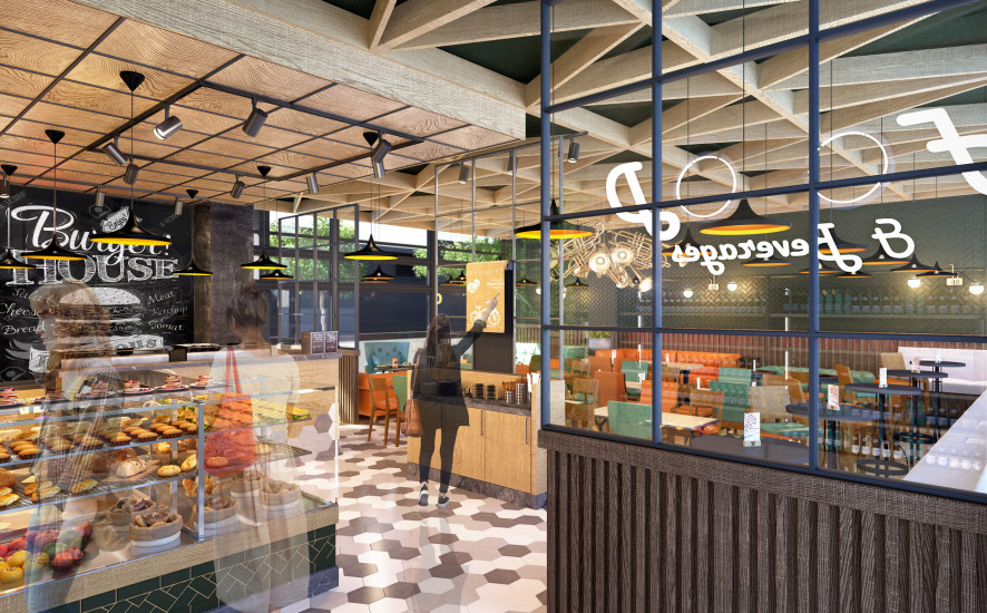
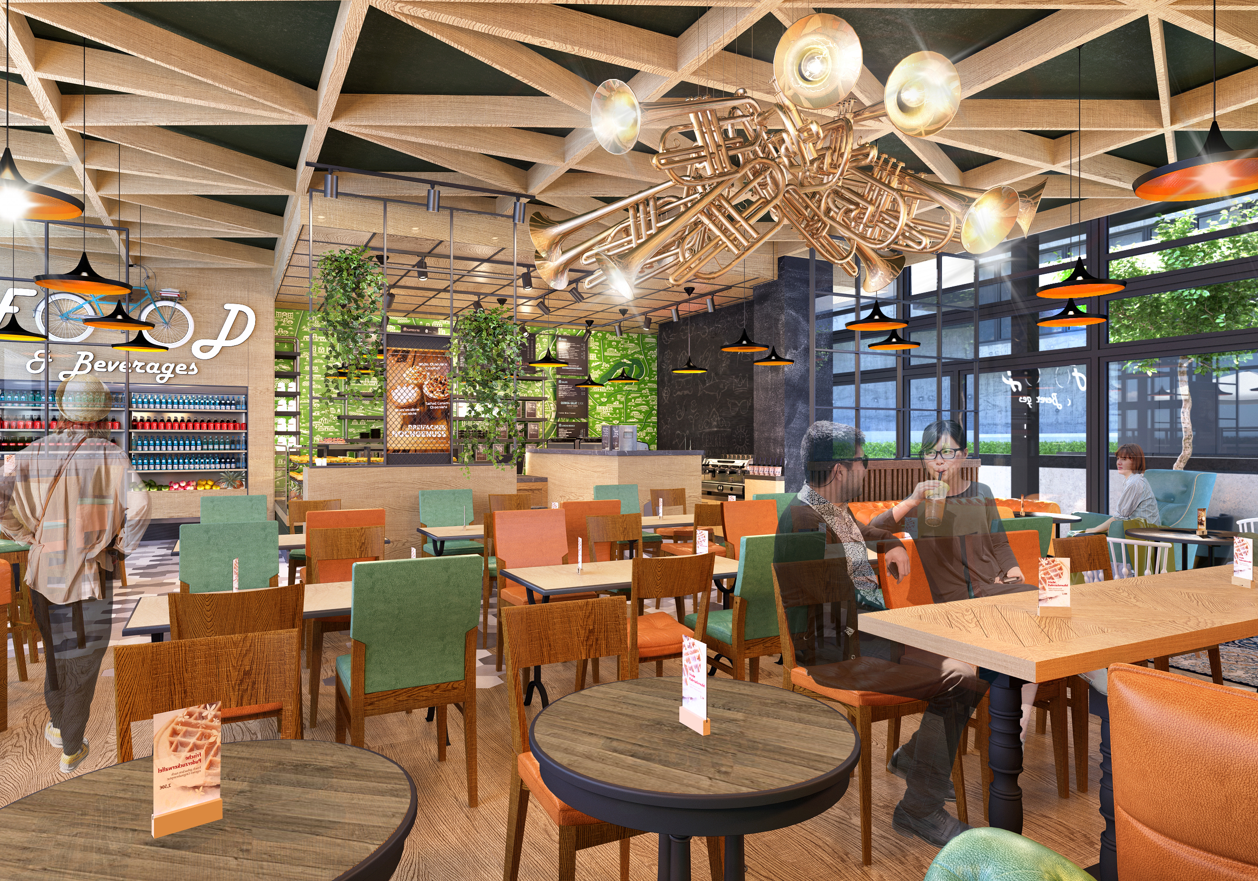
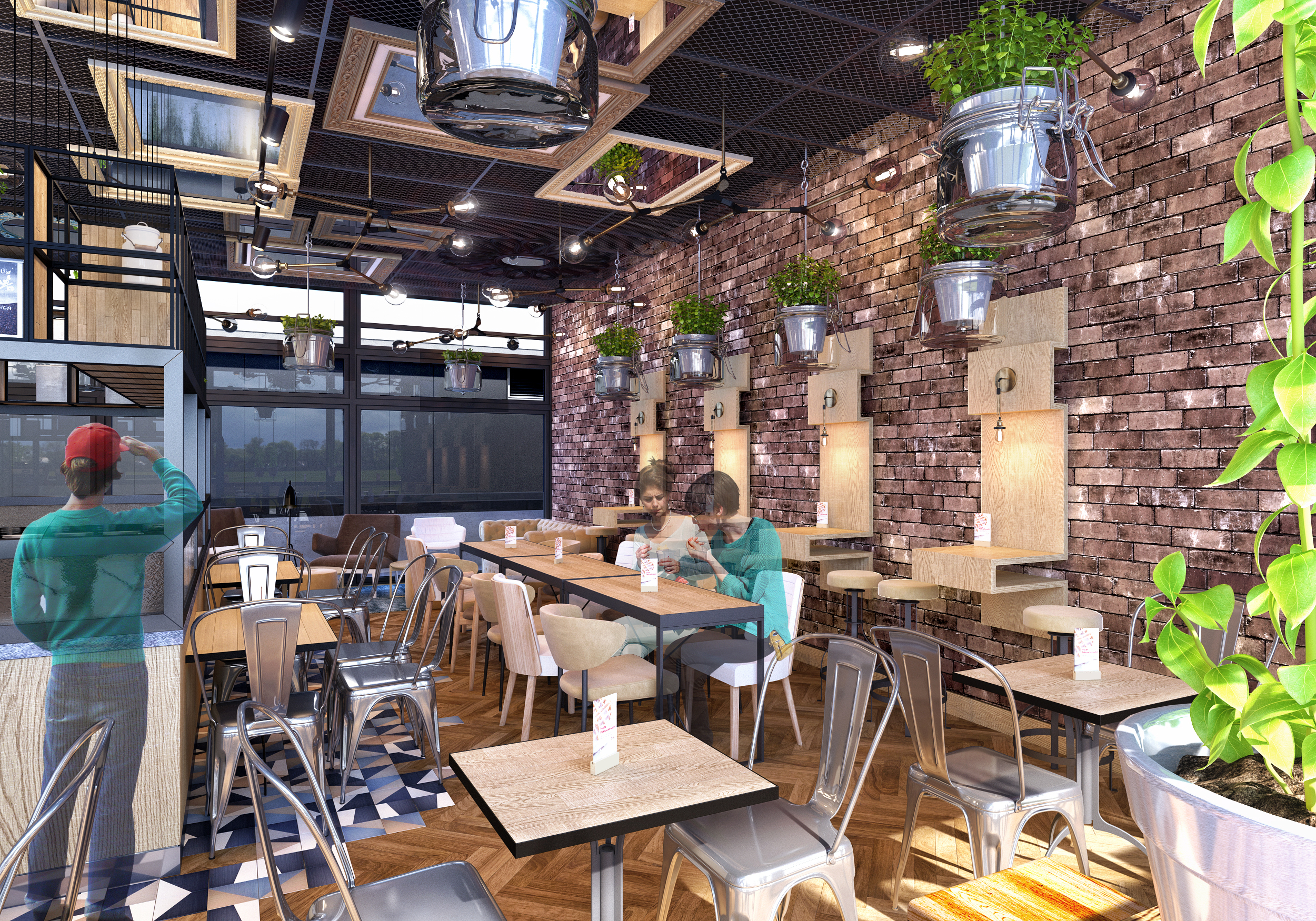
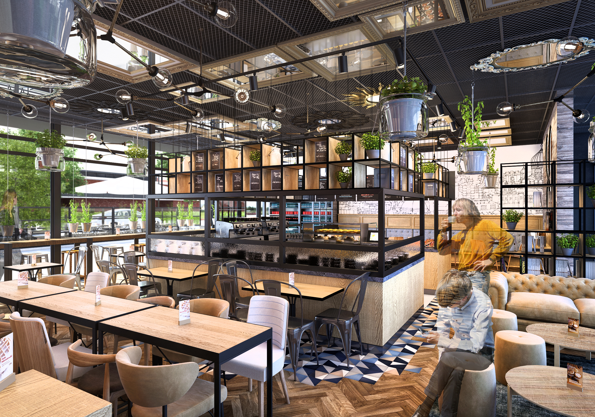
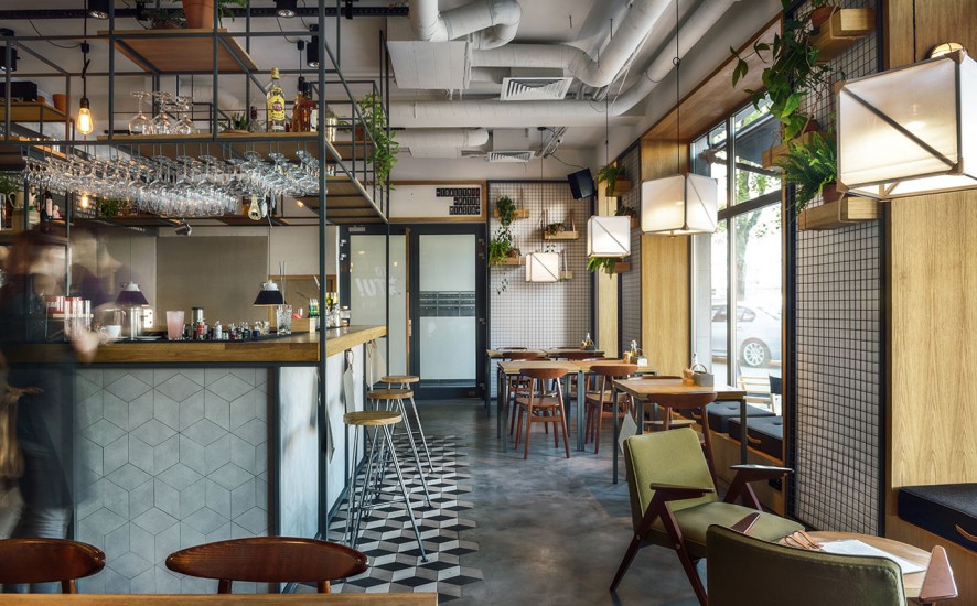
We decided to go for Jazz Club style with bits of modern trends. To increase those feelings we have specially designed an unique lamp made of trumpets. Dark wood and leather in bottle green and honey colors will give interior some fresh air and space.
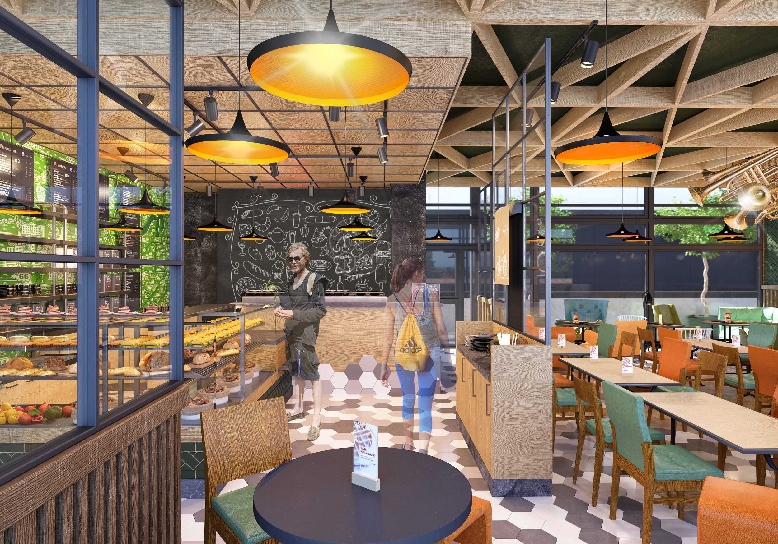
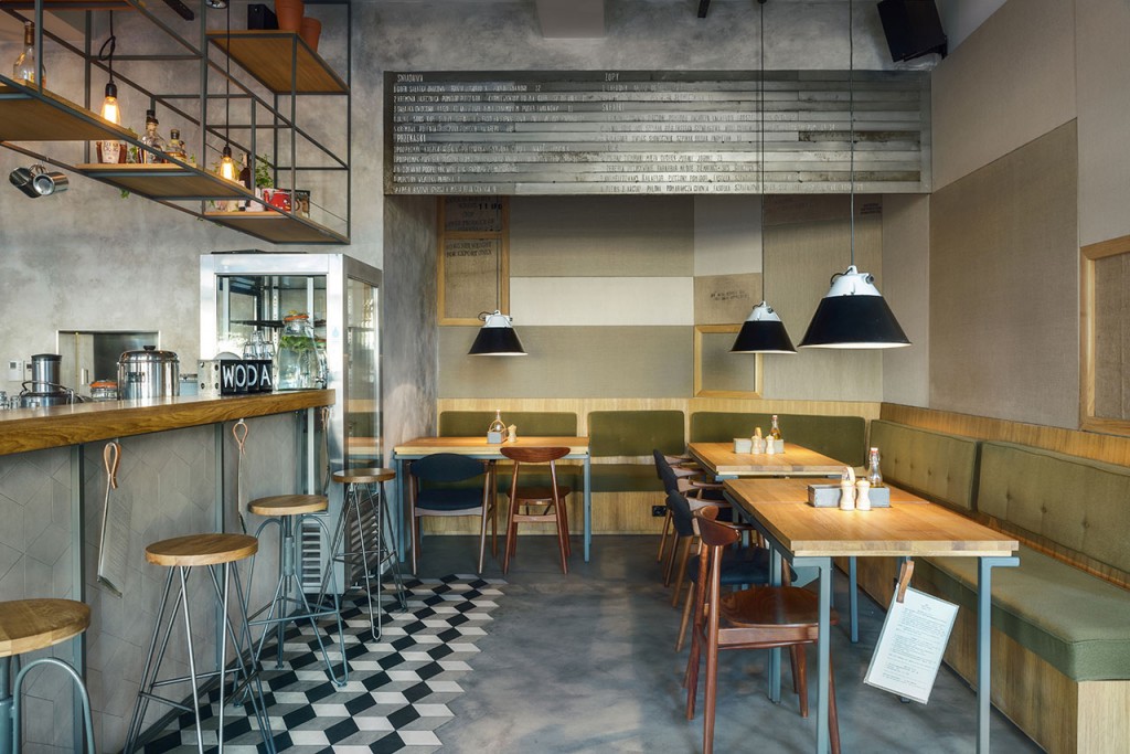
By using floor materials we divided interior in two main spaces based on their function. First – order zone, we covered with modern, hexagonal tails in subdued, beige colors. Second – table zone, is finished with wood to make it more comfortable and warm. Both floors meet and mix in the middle giving impression of smooth transition.
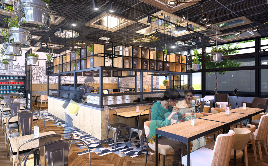
In this version we left bar where it was – under the wall, but we made some improvements based on local vison. First of all, we have hidden all that’s going on behind the bar by putting in front of a customer fridge with sandwiches and snacks. Now, what was the weakest point of this interior became a very strong place. Also we made a use of a wall behind the bar by putting there useful shelves and made some space for menu, commercials and slogans. For all bar furniture we decided to use warm oak wood with black marble tops.
When it comes to table zone, we didn’t do that much when it comes to organizing tables. We made some movements and adjustments that gave us 68 seats. We have honored the way space was is used now. We left Lounge zone as it was, but gave it new, fresh look with new couches, armchairs and oversize lamps that will serve well for writing and reading. Long couch under the window got new life, we gave it high, bar tables and seats making it more of a short time space to use. Main zone got some new furniture as well. Oak table tops will work well with bar and leather covered chairs will give all the comfort we need.
Big thing about this option is back wall. We decided to cover it with bottle green, milled tiles and place elegant but delicate lamps. We think that it’s a very good place for pictures of customers, VIP`s and event souvenirs.
Last but not least, the celling. Made of same oak that we used for table tops and bar furniture. Lowered above the bar and open above table zone made of wooden beams formed in triangles.
Design by Dominika Ladowska, Marcin Otulak, Marci Boratyn.

