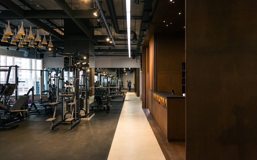
They create interior where sport is not a goal, but a part of everyday life. Where routine visits to the gym are just a pleasant habit and leading to health and wellness improvement. Design and sport are willing to cooperate together.
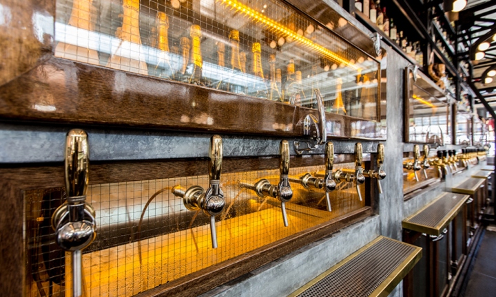
Ironside Fish & Oyster’s nautical design concept is a celebration of San Diego’s history as a major U.S. seaport and fishing capital. A huge 1920’s warehouse, originally home to Ironside Metal Works, provided a rich architectural canvas with which to work. Transformation of the still-robust structure began with preserving the original beams and hand painted exterior façade in homage to its significant industrial roots.
More information and pic from Retail Design Blog

Designer Nikita Konkin has created a packaging concept design that makes buying pasta a bit more fun. The trio of designs have the face of a woman on the box, with the cut-out ‘hair’ window showing the pasta inside.
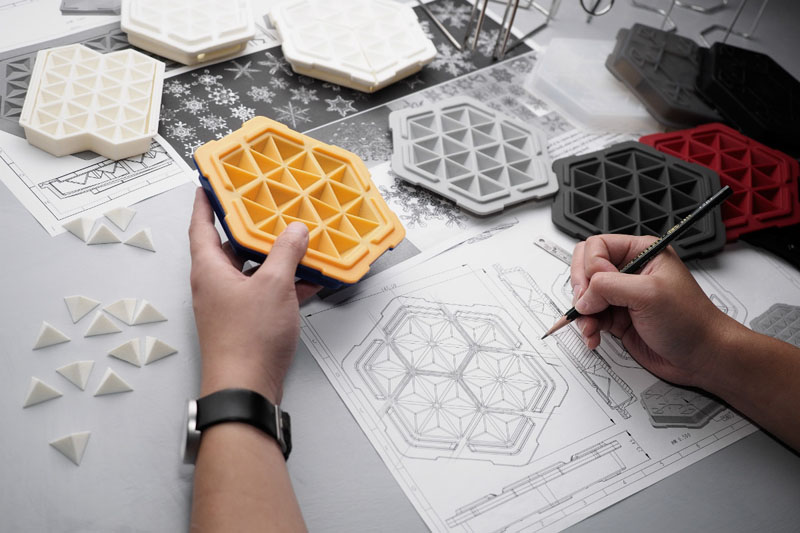
A team of designers at THAT! Inventions have created an ice cube tray that freezes liquids in 10 minutes.
They wanted to re-think the traditional ice cube tray, and they ended up designing FreezTHAT!, a tray with a unique shape that has cooling fluid sealed within it’s flexible, silicone body.
Watch the video below to learn more, or visit their Kickstarter campaign, here.
More information CONTEMPORIST.
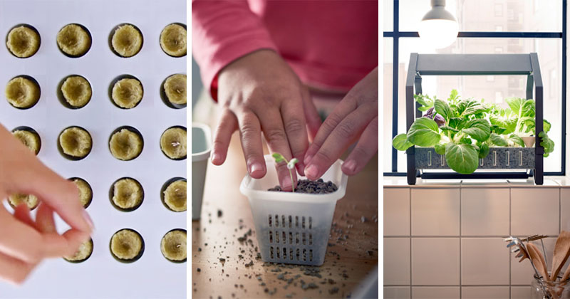
IKEA is making it easier to grow your own leafy greens and herbs in your home, with the introduction of a new series named KRYDDA/VÄXER.
The hydroponic system lets you grow plants in water, without the use of soil. For more info, you can watch the video below.
The kit includes everything you need to get growing.

A Feist Forest X Miscellaneous Adventures collaboration : A beautiful Cherry Wren Snack Cup and Spoon. Whilst we made the cups, Andrew of MA carved the ‘tail feather’ spoons. Handmade in small batches of 10, using home-grown British Cherry. Designed as a functional studio companion to serve up snacks, such as seeds or chocolate eggs by the dozen.
Fine this items FEISTFOREST.

A singular building, the Circular Pavilion has nothing round. The name describes the process, which follows the circular economy principles, according to which ones’ waste become others’ ressources. Faced with the depletion of natural resources and aims for the «Zero Metropolis Waste» ambition, this pavilion demonstrates the potential of re-use in architecture, which fits in the context of COP 21 (the 2015 United Nations Climate Change Conference) in Paris. About 60% of the implemented materials here finds a second life.
Photos and article form ARCHDAILY.
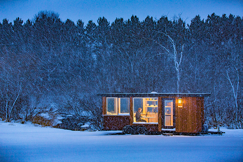
Clad with cedar wood and corten steel, this mobile dwelling provides comfortable living accommodation suitable for a range of climates. Named ‘vista‘, the 160 square foot cabin offers space for one or two occupants, with dedicated sleeping, living, and bathing facilities. Conceived as a private space that shares a direct relationship with nature, large operable low-E windows on three sides of the unit offer uninterrupted views. the standard mobile home is 20 feet long, over 8 feet wide, and more than 9 feet in height, with a larger version also available.
All image escape traveler.
More DESIGNBOOM.
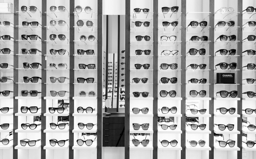
The “Ottica Annoni”, glasses and optometry historical shop, decides to move, after more than 100 years, in a larger and brighter space on the ground floor of a nearby building of the Monza’s city center. The new shop has an “L” shape, where, in the widest part facing the public road, takes place the sales activities, while in the deepest part there are office, warehouse and service areas.
The design’s process challenge was to expose at least 500 glasses giving however to the customer the feel to be in a boutique and not in a department store. The store’s concept turns around the vertical blades that run from the floor, on the walls, to the ceiling expanding the perception of the space and becoming an elegant “structure” for showing glasses on light and backlit Plexiglas shelves. The final customer perception is not a confusing display of numerous articles, but a feeling of linearity and refinement in showing each pair of glasse.
More about the project OTTICA ANNONI.

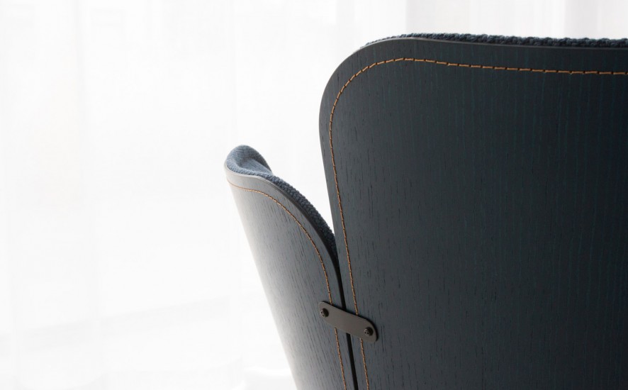
Stockholm studio Färg & Blanche has used its signature “wood tailoring” technique to produce a collection of sofas and chairs for furniture brand Gärsnäs . The process – which the pair have been developing for several years – involves stitching fabric directly onto wood using a customised sewing machine.
Article and photos DEZEEN.