Brend new photo session of the redesign foodcourt area in Arkady Wrocławskie.
ARS RETAIL GROUP was responsible for creating the concept and executive design.
Design Dominika Ladowska, Maria Jankowska, Piotr Tamkun.
Foto @StrawArtPhotography
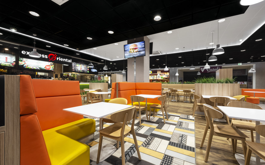
Brend new photo session of the redesign foodcourt area in Arkady Wrocławskie.
ARS RETAIL GROUP was responsible for creating the concept and executive design.
Design Dominika Ladowska, Maria Jankowska, Piotr Tamkun.
Foto @StrawArtPhotography
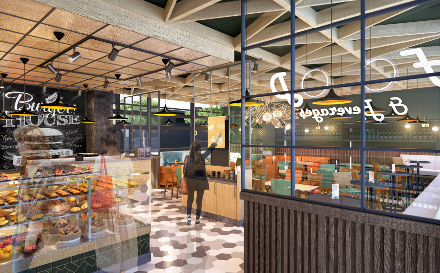
We decided to go for Jazz Club style with bits of modern trends. To increase those feelings we have specially designed an unique lamp made of trumpets. Dark wood and leather in bottle green and honey colors will give interior some fresh air and space.
By using floor materials we divided interior in two main spaces based on their function. First – order zone, we covered with modern, hexagonal tails in subdued, beige colors. Second – table zone, is finished with wood to make it more comfortable and warm. Both floors meet and mix in the middle giving impression of smooth transition.
In this version we left bar where it was – under the wall, but we made some improvements based on local vison. First of all, we have hidden all that’s going on behind the bar by putting in front of a customer fridge with sandwiches and snacks. Now, what was the weakest point of this interior became a very strong place. Also we made a use of a wall behind the bar by putting there useful shelves and made some space for menu, commercials and slogans. For all bar furniture we decided to use warm oak wood with black marble tops.
When it comes to table zone, we didn’t do that much when it comes to organizing tables. We made some movements and adjustments that gave us 68 seats. We have honored the way space was is used now. We left Lounge zone as it was, but gave it new, fresh look with new couches, armchairs and oversize lamps that will serve well for writing and reading. Long couch under the window got new life, we gave it high, bar tables and seats making it more of a short time space to use. Main zone got some new furniture as well. Oak table tops will work well with bar and leather covered chairs will give all the comfort we need.
Big thing about this option is back wall. We decided to cover it with bottle green, milled tiles and place elegant but delicate lamps. We think that it’s a very good place for pictures of customers, VIP`s and event souvenirs.
Last but not least, the celling. Made of same oak that we used for table tops and bar furniture. Lowered above the bar and open above table zone made of wooden beams formed in triangles.
Design by Dominika Ladowska, Marcin Otulak, Marci Boratyn.
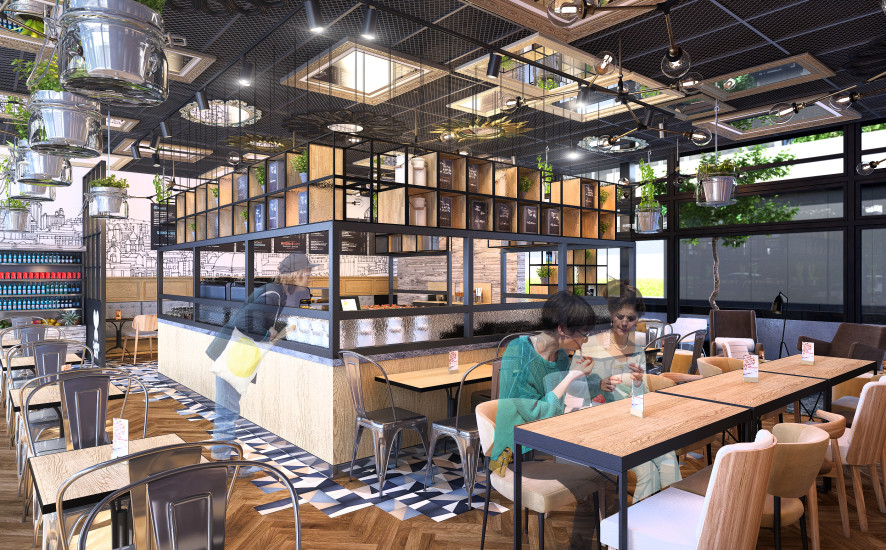
We went for industrial, crude furniture. Plants in jars hanging form the celling, same warm oak wood connected with dark metal frames and old brick on the back wall makes this interior darker but warmer and cozy.
Our revolution is best seen when it comes to the bar that is moved to the middle. It became an island and a furniture by itself. With this option, short term customers will be led by tiles on the floor from entrance to the bar and out by second exit to the library.
If you want to have a sit, you can choose form 76 seats we have fitted in this option. You can use comfortable long couch under the wall, where bar used to be, or use bar chairs under the site and watch people walking by. There are tables for two and four and if there is a need to connect them for bigger group it can be done easily.
Again we left Lounge zone as it was giving it new furniture and a carpet that will make it feel more like home. New exciting thing here are hanging tables with bar chairs. Those are perfect as a quite table for two, with romantic lamp, and view from above others.
Very strong element of this interior is our celling made of steel mesh. To make it even more entertaining we decided to decorate it with mirrors in various frames. This way we will make interior look bigger and mysterious.
Design by Dominika Ladowska, Marcin Otulak, Marcin Boratyn.
Visualisation by Piotr Tamkun.
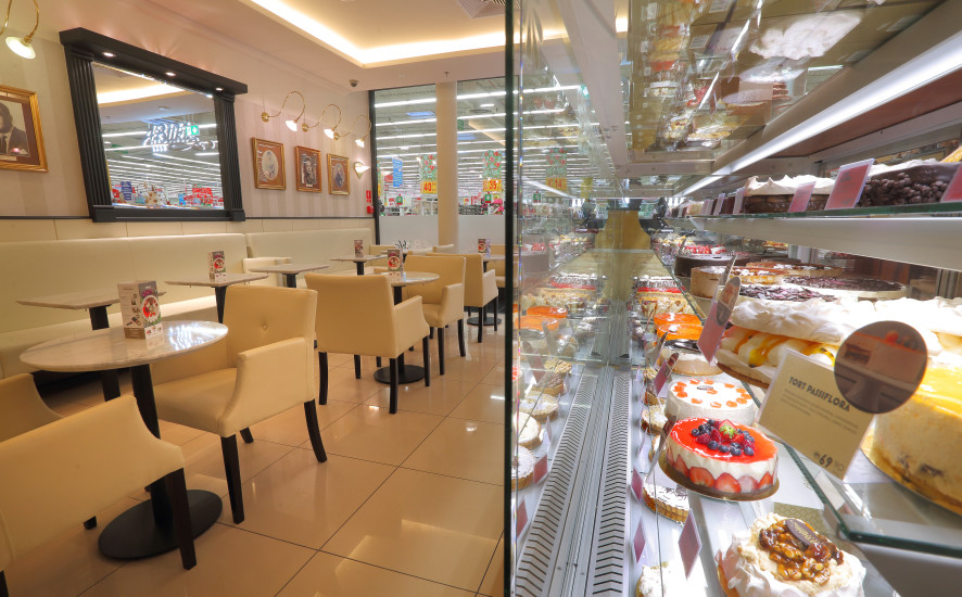
ARS Retail Group was responsible for the installation of a new system of furniture and renovation works in A.Blikle in Shopping Center Ursynów – Warsaw. A.Blikle – Warsaw confectionery company. It was founded September 11, 1869 year by Antoni Kazimierz Blikle. Customized confectionery chain conveying the atmosphere of the French “patisserie” always delivering quality products with onsite preparation.
Foto: Grzegorz Śledź
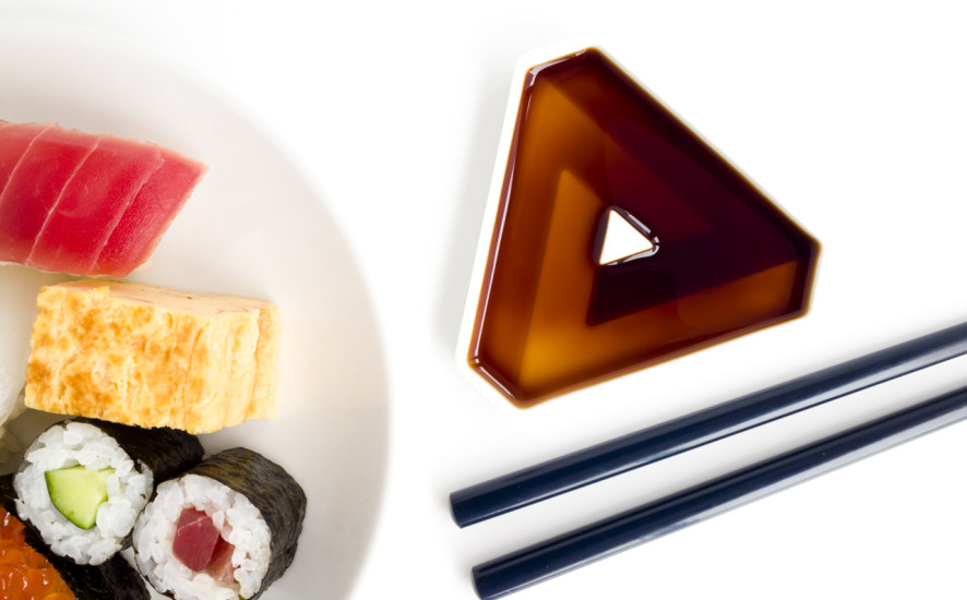
The story of how #SoyShape’s come to be.
Filmed with the craftsmen and craftswomen of Gifu, Japan in Toki city, and at our studio in Tokyo.
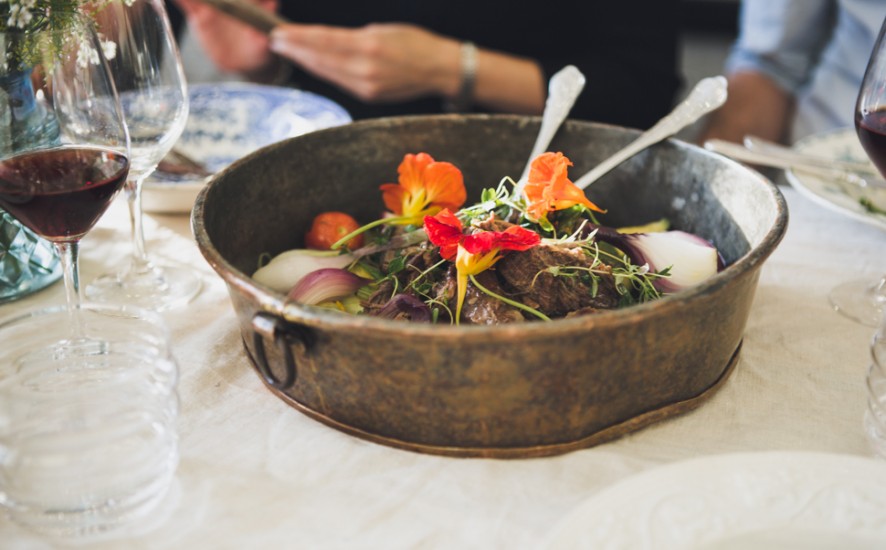
Owned by food writer Mette Helbæk and chef Flemming Schiøtt Hansen, their mission is to serve food that is “clean, simple and local”. Stedsans, which refers to the idea of ‘a sense of place’ in Danish, has a menu that focuses on plants and vegetables from organic farmers in the region.
Photography by Jessica Jungbauer. More info IGNANT
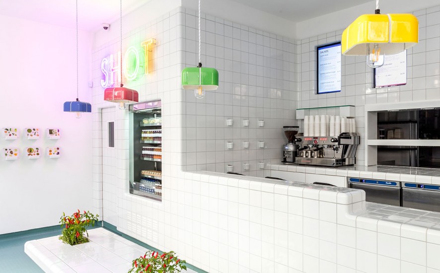
SHOT is a concept eatery that offers super-healthy, gourmet meals and treats at fast-food speed. Inspired by tiled Victorian laboratories and the curved ceramics of the London Underground.
More info and photos YAZTER.
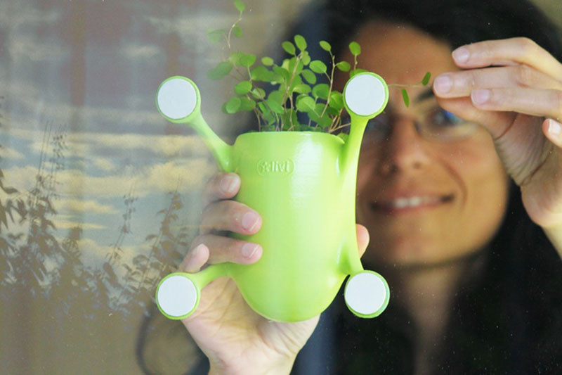
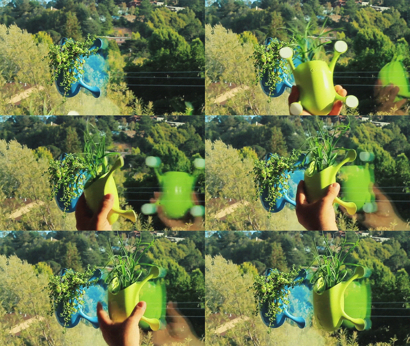
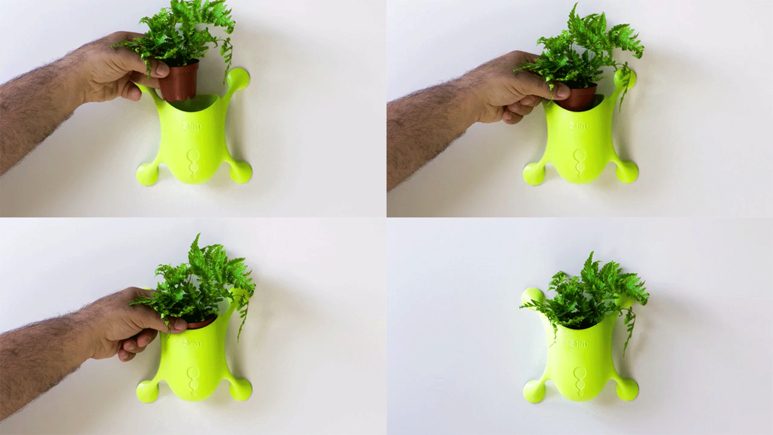
Livi designers from USA – San Francisco, design the little planters. This elements looks like little creatures. You can stick them to any sufrace in Your home.
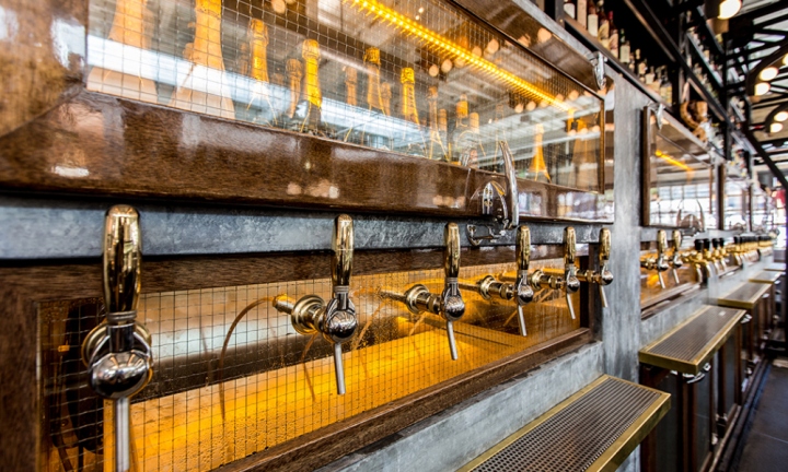
Ironside Fish & Oyster’s nautical design concept is a celebration of San Diego’s history as a major U.S. seaport and fishing capital. A huge 1920’s warehouse, originally home to Ironside Metal Works, provided a rich architectural canvas with which to work. Transformation of the still-robust structure began with preserving the original beams and hand painted exterior façade in homage to its significant industrial roots.
More information and pic from Retail Design Blog
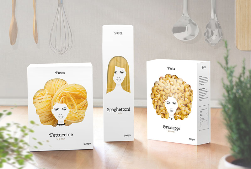
Designer Nikita Konkin has created a packaging concept design that makes buying pasta a bit more fun. The trio of designs have the face of a woman on the box, with the cut-out ‘hair’ window showing the pasta inside.