ArchitectureDesignInteriorPolish Design

004

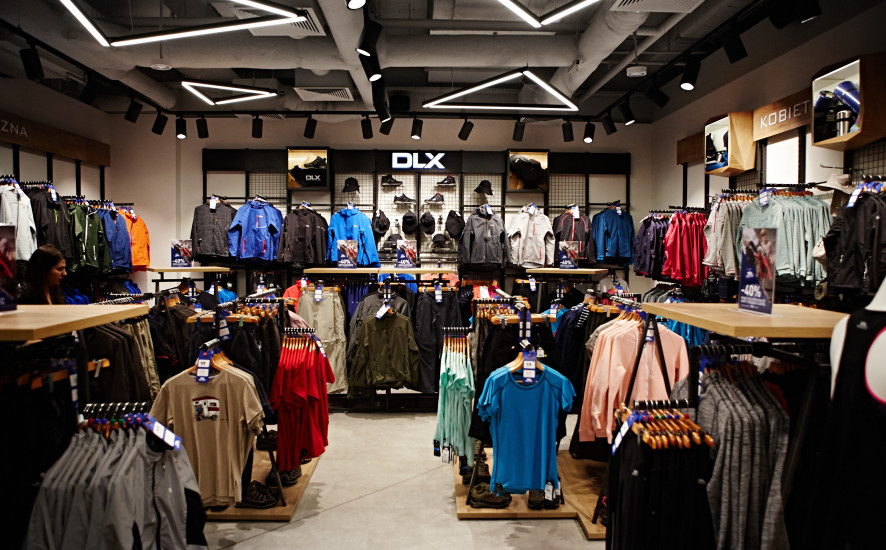
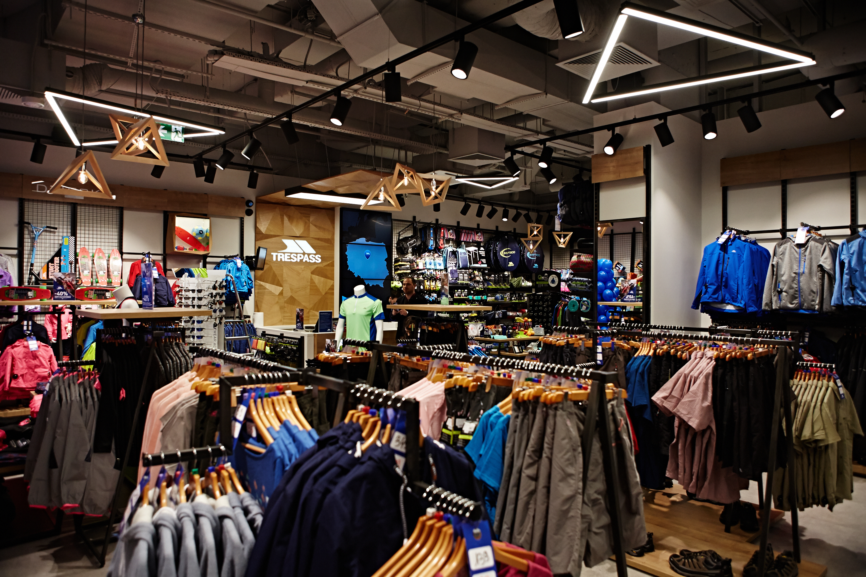
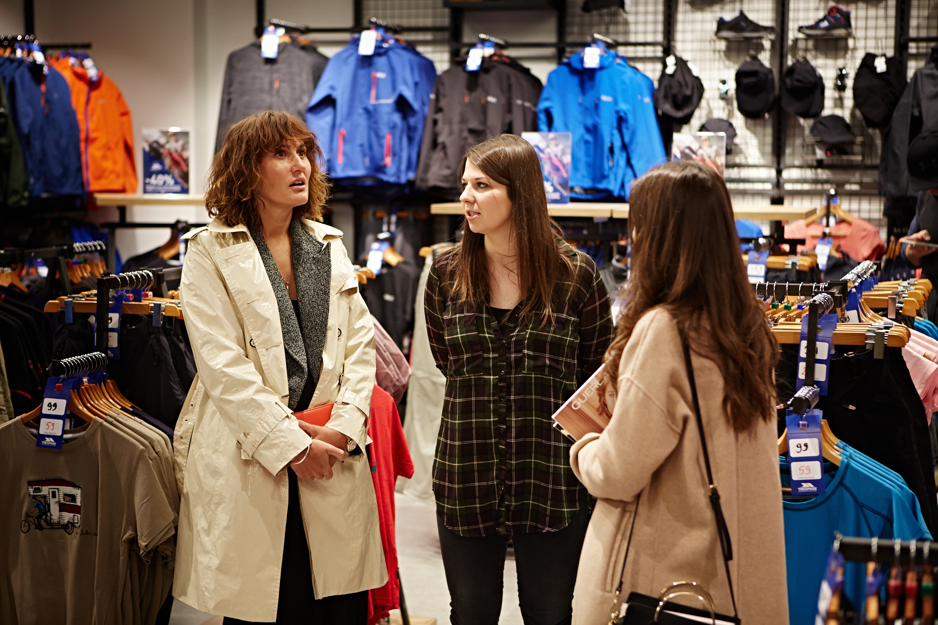
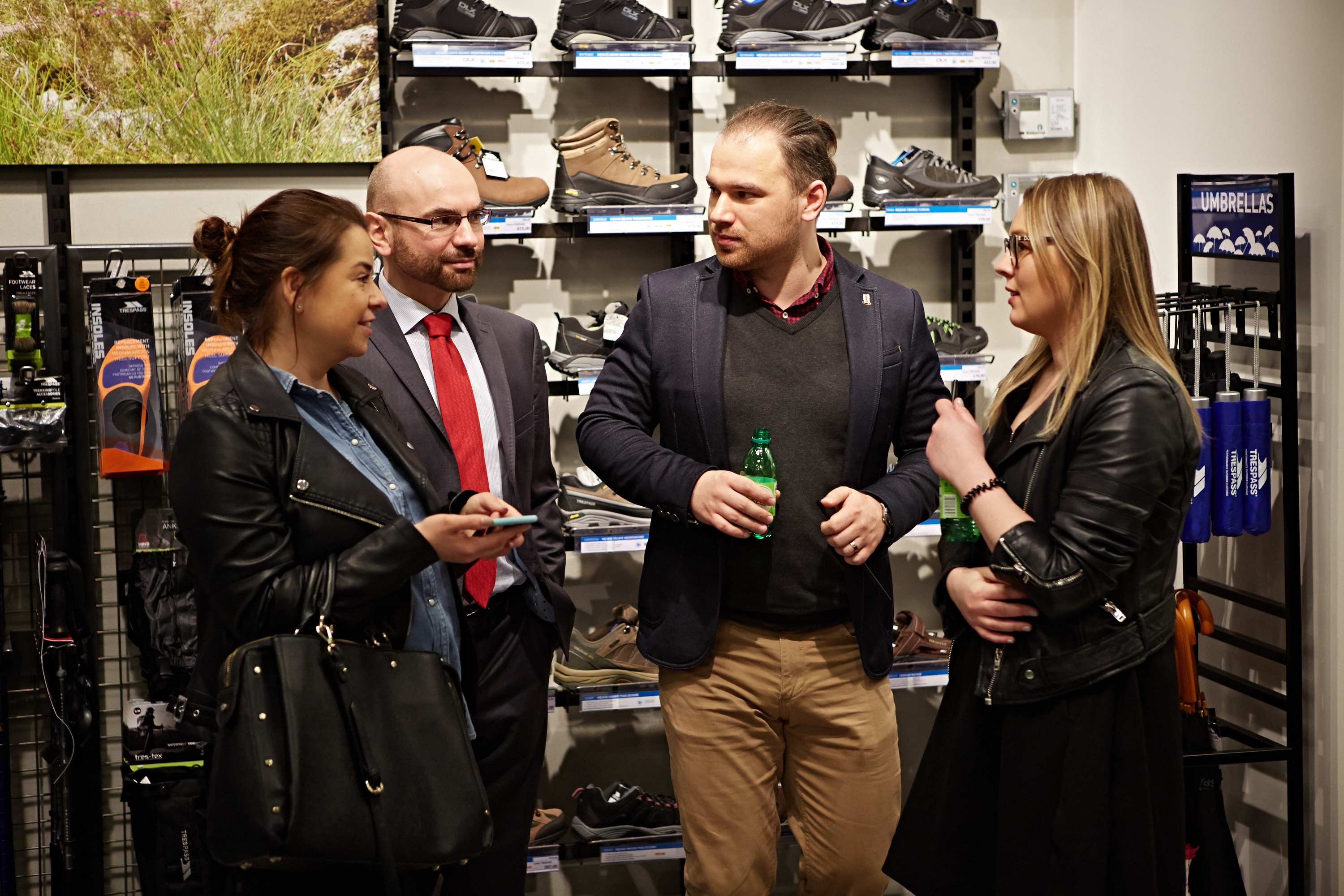
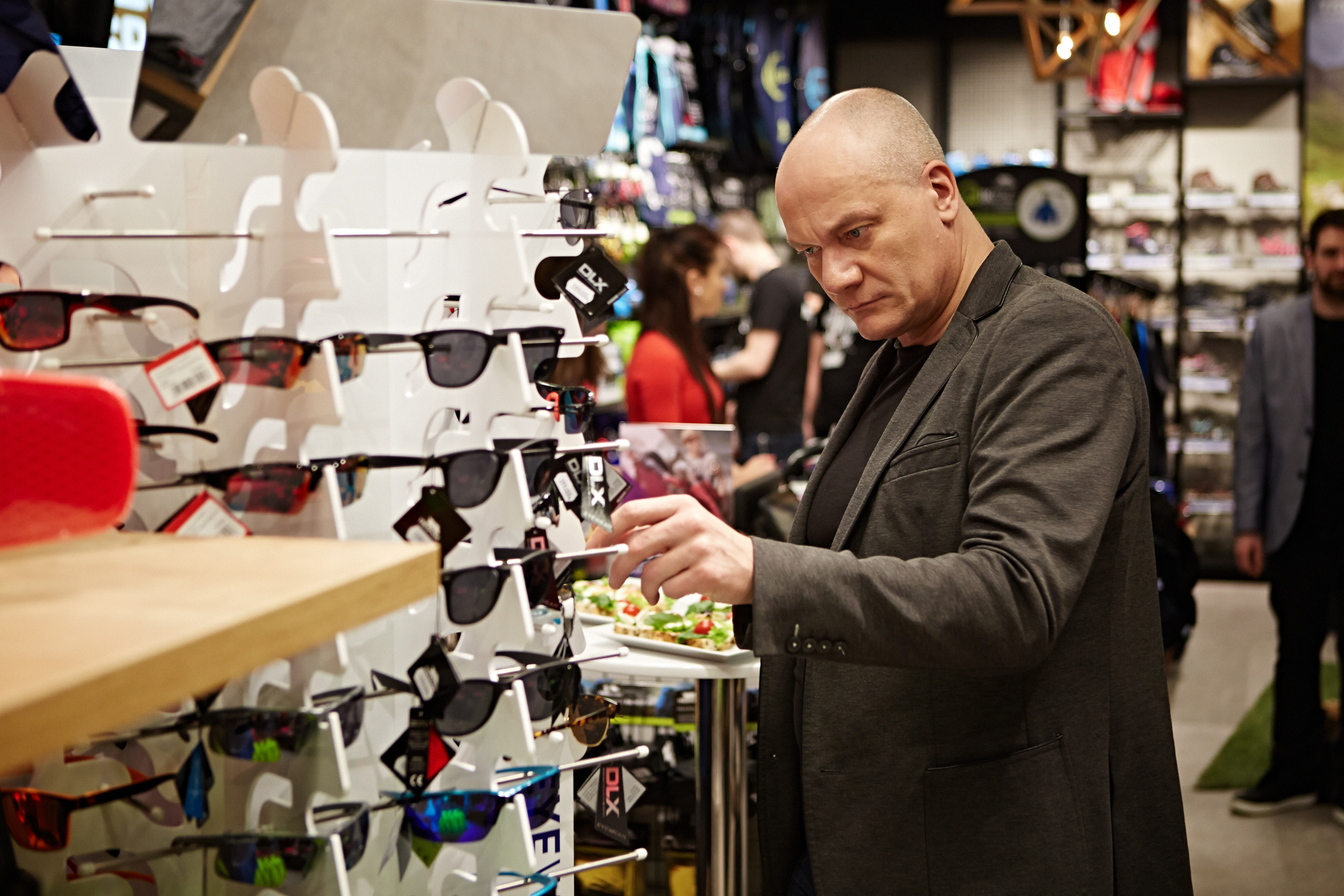
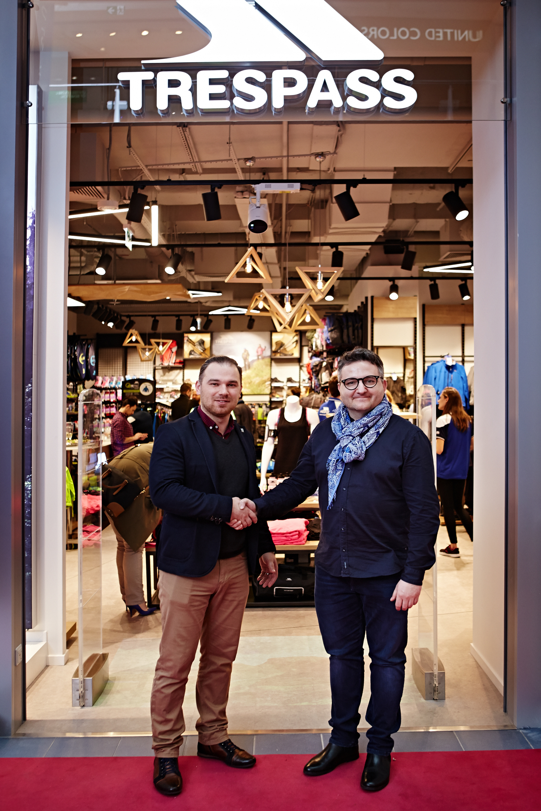
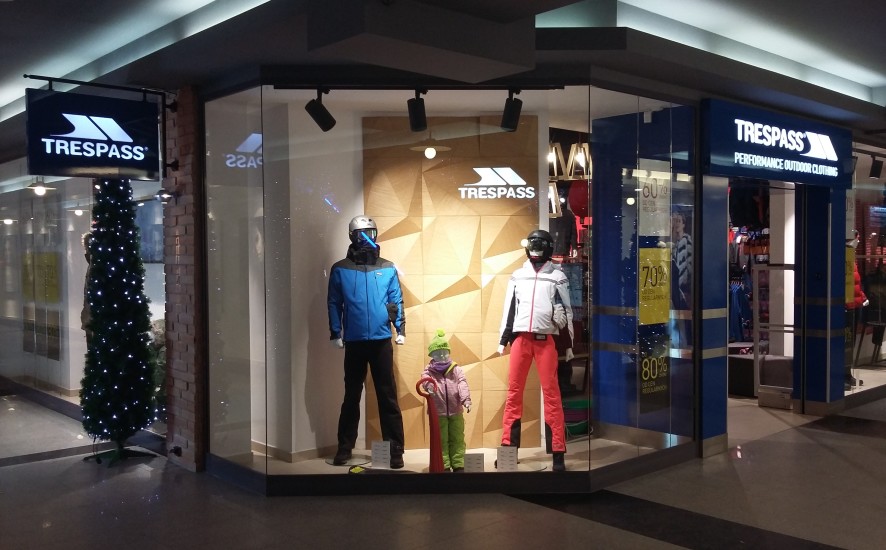
A new Trespass shop in Blue City Shopping Mall opened in Warsaw – this time we are not only the designers and builders but also the store operators! Our daughter company ARS Shops became Trespass partner in the region and will be responsible for shop managment and further development of regular stores.

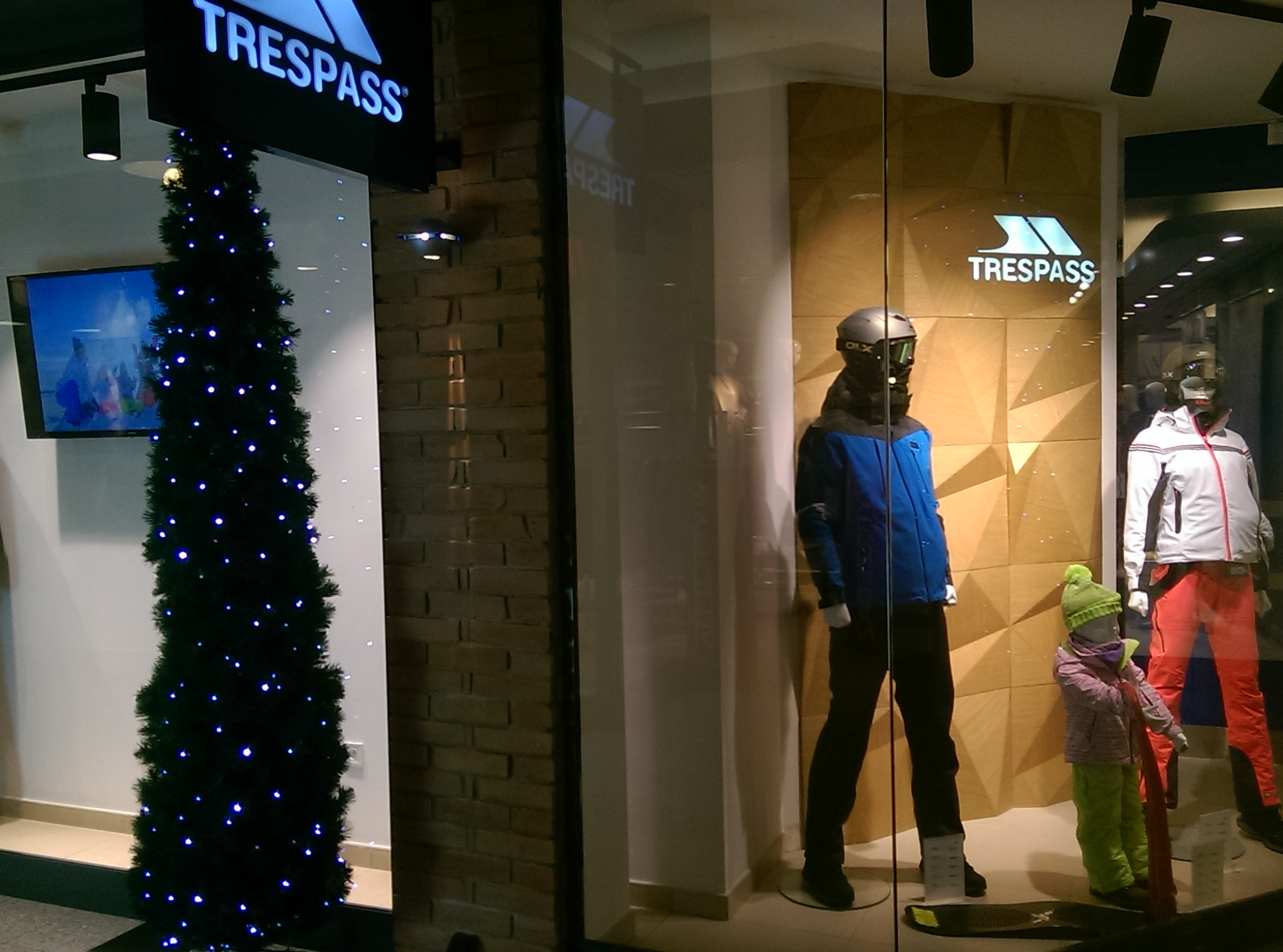
The shop has a friendly interior and it was designed with the adventure lover in mind.  As Trespass is an outdoor brand, focused on active lifestyle, we furbished the interior with many nature inspired elements – says Karolina Czapska, architect from ARS Retail Group. Pay attention to the rock, wood and grass imitations, wildlife climate in fitting rooms and a special path where you can test your trekking shoes.

We are looking for more attractive locations for this great concept. This is just the beginning of our story!

See more INSTAGRAM @trespasspoland

003

051

074

077

098

DesignInteriorPolish Design

20170124_194139

The Polish retail landscape is yet again richer! A new Trespass shop was opened in Rzeszów in Galeria Graffica.

The concept  for this brand was fully created by ARS Retail Group. Concrete, wood, green glass, and high quality natural materials are just a few architectural elements you can find inside. They all resemble the climate of the brand. After all, Trespass is an outdoor clothing company whose customers are active and like adventure.

We are really proud to say that the shop in Galeria Graffica is the first store where we implemented the new design.

Design by Karolina Czapska.

More information soon! :)

IMAG5698


DesignInterior

09_101

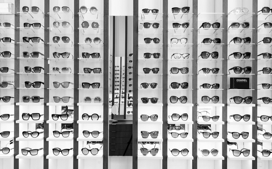
The “Ottica Annoni”, glasses and optometry historical shop, decides to move, after more than 100 years, in a larger and brighter space on the ground floor of a nearby building of the Monza’s city center. The new shop has an “L” shape, where, in the widest part facing the public road, takes place the sales activities, while in the deepest part there are office, warehouse and service areas.

The design’s process challenge was to expose at least 500 glasses giving however to the customer the feel to be in a boutique and not in a department store. The store’s concept turns around the vertical blades that run from the floor, on the walls, to the ceiling expanding the perception of the space and becoming an elegant “structure” for showing glasses on light and backlit Plexiglas shelves. The final customer perception is not a confusing display of numerous articles, but a feeling of linearity and refinement in showing each pair of glasse.

More about the project OTTICA ANNONI.

07_650 — kopia

02_879 — kopia

04_189 — kopia

05_753 — kopia

03_839 — kopia


ArchitectureDesignInterior

18367363871_7de134152b_k__880

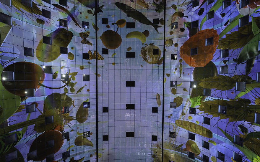
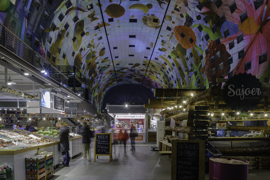
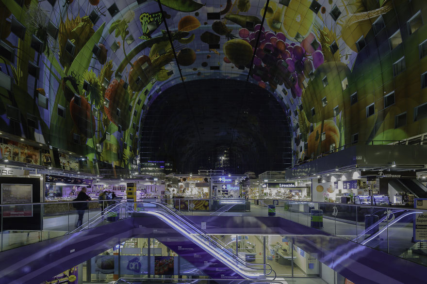
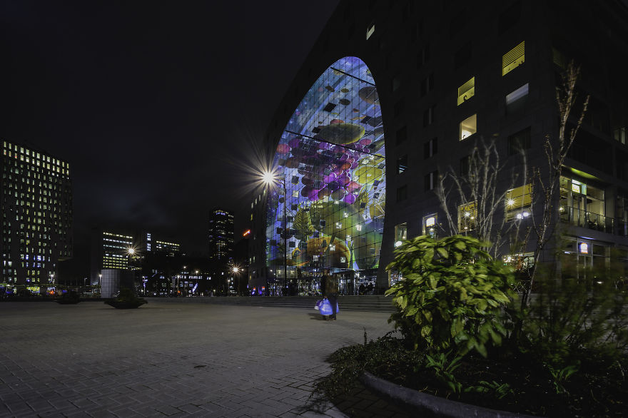
I love the Market Hall (or in Dutch “Markthal”) in Rotterdam! This enormous building, opened in 2014 by Queen Maxima, is home to many little food shops, varying from doughnuts to tapas, and from Chinese food to Surinamese food (Surinamese sandwiches are the best).

A delicious place to visit, and voted by The Guardian as one of Europe’s top ten food markets! When you are in Rotterdam, make sure to visit this place!

More info: luvo-photography.com

This article was submitted through our awesome BOREDPANDA.

18259474285_9c46639eab_k__880

18324741995_fd630cc153_k__880

18472375142_82aaa469a9_k__880

DesignInteriorPolish DesignTechnology

ARS mBank  - 11


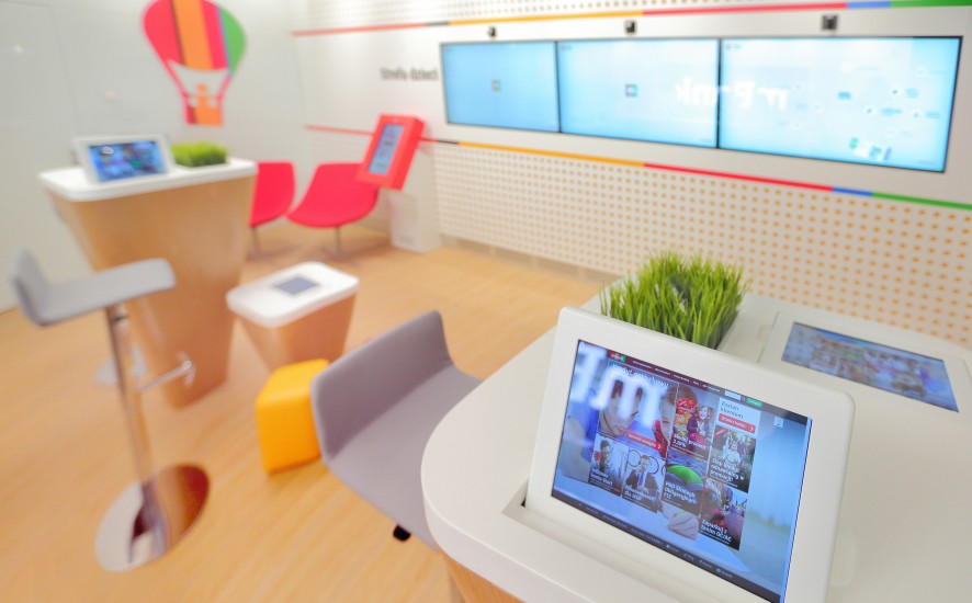
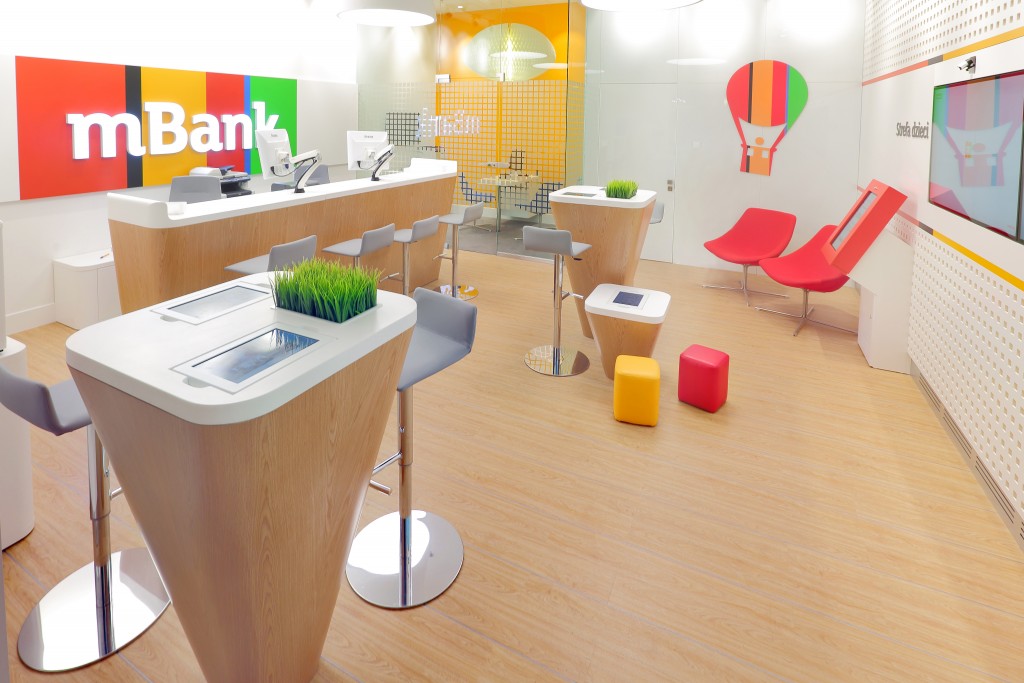
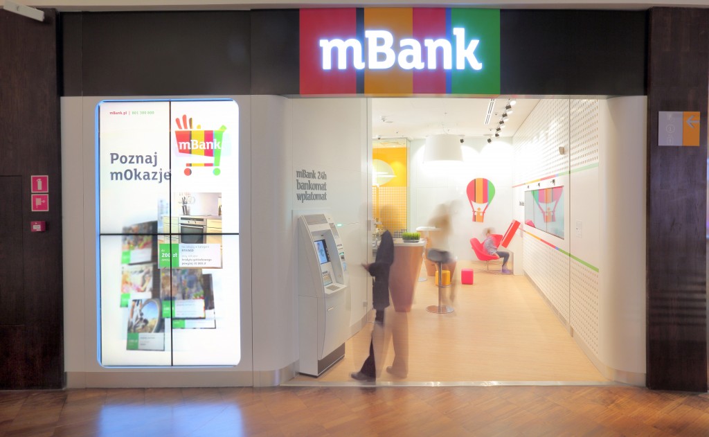
In November 2014, mBank launched the project of light, ultra-modern banking in brand new technology. Clients are to be attracted by ultra-modern, interactive screens with Kinect feature (responding to touch) – absorbing potential clients. Also visit retaildesignblog.

ARS mBank - 6

ARS mBank - 1


Design: ARS Retail+Shopfitting / Katarzyna Domosławska
Photography: Sol&Moon Photography / Grzegorz Śledź